
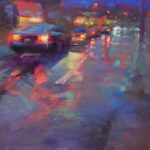
Whistler’s ‘The Guidecca’
James McNeill Whistler’s lovely sketch “The Guidecca” seems a good way to symbolize saying farewell to the old year and welcoming the new since I think this piece could either be a sunset or a sunrise.

Guidecca refers to the Canale della Guidecca that runs between Venice and the Isola della Guidecca to the south of Venice. Standing on the island is Il Redentore, a late Renaissance church. Is that it in the distance? (I’ve never been to Venice – it’s at the top of my bucket list! – so I cannot tell from experience.)
The luminous quality of late or early light is extraordinary. With a few pastels and a few strokes, and with much paper left visible, Whistler undoubtedly created this picture from life. Apparently Whistler hired a gondola by the month which he would load up with painting supplies and then the gondolier would take him to various sketching locations. Can’t imagine being able to afford that these days!
We are given an image with great depth: in the foreground the dark gondola with its reflection, the mid-canal ship, buildings and docked ships in the middle ground, and the bridge and church lightly indicated in the distance. The sky is beautifully reflected in the quiet water.
When it was exhibited in London in 1881, the critic for The Athenaeum wrote, “It is difficult to resist the charm of the silvery and fleshtones in…The Guidecca, which comprises a gondola floating on a calm and exquisitely graded water.”
The pastel was eventually given by Whistler to the sculptor Sir Joseph Edgar Boehm who made a bust of his friend. On the back of the pastel is written, “To Boehm – whose Art is exquisite and whose sympathy is sufficient.” Boehm appreciated the pastel, “the every joy-giving picture,” and called it ‘the bella Venetia.’
I’d love to hear your thoughts about this pastel.
______________________________________________________________________
The Contest!!!
Thanks to all of you who have recently subscribed. I was overwhelmed by the response and decided that one winner was not enough! So I’ll have my honey Cam randomly pick three winners.
As well, I’ve decided to reward those who joined my subscriber list before the official launch and draw a winner from their names also.
As soon as we’ve made the draw, I’ll be contacting the lucky ones with the news so they can pick their print. I’ll announce the winners in my next blog. Stay tuned!!
_______________________________________________________________________________
Wishing you all your most creative pastelling year ever!! Thanks for taking this journey of how to pastel with me. Please share this blog with all those you think might benefit from the website.
HAPPY NEW YEAR!!!
~ Gail
PS. Much of the information for this blog came from this book given to me years ago by my friend Zig.


2 thoughts on “Whistler’s pastel “The Guidecca” to wish you a Happy New Year!!”
I have read that Whistler’s pastel painting was done on gray toned paper.
That made me wonder why he chose that color and it is that tone peeking through that
creates such a wonderful painting .
I love to tone my painting usually in corals and reds, I have to rethink gray!
Thanks for the art history lesson.
Congratulations on your new blog. Sandi
Yes Sandi, Whistler did do a lot of work on grey paper (I just amended my blog to include that detail under the pastel).
He also used brown paper. I think he chose neutral colours (warm or cool depending on the situation) in a middle value.
Like you, I like those warm red undertones but it’s always good to try out different underlay colours as they do affect the outcome!
Glad you enjoyed the blog 🙂
Gail