Recently in my IGNITE! art-making membership, a member asked about how to make an interesting painting from a boring photo. This isn’t an uncommon question. I’ve also been asked: “How do I the greyness that I see in my photo more colourful in my painting?” Or how about this: “I was so taken with the colourful scene but when I got home and looked at the photos, I wondered where all the colour had gone.” In all these cases, pushing colour in our paintings is the answer.
By pushing colour, we can take a rather bland photo and jazz up the colour. Pushing colour is about exaggerating any small hints of colour you glimpse in your photo. It’s about pushing those tiny colour suggestions into a full-blown saturated colour arena!
Recently I did just this. I was in Ontario a couple of years ago and had taken a few photos from the car of some beautiful trees. I admit I was disappointed when I saw the pictures later but I knew there was still something there to work with. And I knew I could push the colour!
I’m going to take you through my process. This was a piece I did for last year’s 31-pastels-in-31-days Annual Challenge that we hold every October in the HowToPastel Facebook group. (You can see some of my other pieces in this blog post.)
First the photo reference.
As you can see, it’s not that interesting at first glance.
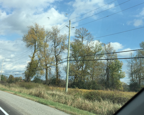
So why did I take the photo? I loved the shape of the trees…and the colour. Looking at the photo though, there doesn’t seem to be much colour does there? That’s where the “pushing colour” idea comes in.
First, my thumbnail.

The trees are the stars of the show. I also liked the natural interruption that the gap between the stands of trees makes and so included it by creating two uneven shapes on either side of a space. (I also tried a thumbnail in portrait format but that put all the emphasis on the gap rather than on the all-important trees.)

I wanted this painting to be a full-on autumn picture full of warm colours. So I started with a cool colour under the trees. I used purples under what will be orange foliage colours. The sky seems to have a greenish feel to it, typical of some winter skies, and so I pushed the idea of greens by using a light green in my first layer.

Then I began to build the painting, loosely and lightly at the start. As I progressed, I added more colours to my palette only after I’d used (and pushed!) what I already had in hand. Even when I feel the desperate need to add another colour, I try to hold back this inclination as long as possible….or completely!

As I moved forward on the piece, I felt I needed to lighten the sky in the lower part to create the feeling of distance.
I also finally added the visible parts of the tree trunks. I used the reference photo for inspiration but basically added them in groupings that felt balanced yet interesting.

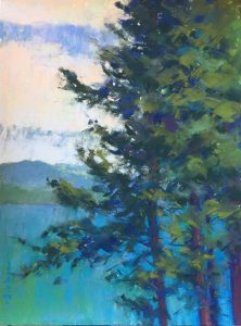
I’m nearing the end now. I opened up areas in the lower parts of the trees to allow more of the sky to come through. I added a bit of detail in the darker grasses in the front but was careful to retain a feeling of looseness. I also wanted to make it easy for the viewer to enter the painting i.e. not create a visible barrier. And, as you can see, I pumped up the warm saturated colours of the foliage!
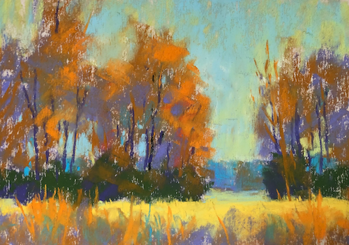
A few more tweaks (can you pick out the changes?) and it’s done!

Here’s the black-and-white version alongside my thumbnail:


And another comparison:


And finally, here are the Unison Colour pastels that I used.
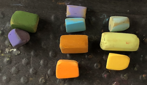

Let’s have a quick look at a couple of ways to push colour:
- Take any hints of colour you see in your photo and apply them in saturated colour – you can always tone them down
- Do a black-and-white version before you start – a tonal sketch. Then choose a monochromatic selection of pastels in three values e.g. blues – light blues, middle value blues, dark blues – and create a monochromatic painting with them. Choose the colour that best suits the mood you want to evoke. A red painting will feel very different from a blue one!
- Working again from your black and white sketch, create a colour study that has nothing to do with the reality you see in the photo, that doesn’t look naturalistic. Just see what happens!
The trick to pushing colour and playing with colour is to use hues of a similar value when you layer – dark over dark, light over light, and middle over middle.
I hope this helps you to see how you too can push colour in your work. You are the artist – YOU have the power!! So take that bland photo that still has something in it that calls you to paint and pump up the colour!
I’d LOVE to know what you thought of this post – if it was helpful, if you have questions, if you have any opinions about what I’ve said or the piece itself.
I look forward to hearing from you!
Until next time,
~ Gail
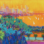
PS. To be inspired by BOLD expansive don’t-hold-back colour, pick up Mark Leach‘s book (if you purchase using this link, I get a tiny commission):












52 thoughts on “Pushing Colour-How To Make Your Bland Photo Into A Bold Painting”
I’m wondering what kind of surface (paper) you like to use?? Also do you use fixitive on the finished piece?
Hey Pam, most of my work these days is done on UART paper – partly because I like it and also because I can get it. I don’t like that it curls but I find taping it down works. I have also heard from one of the people in my IGNITE! drop (thanks Lisa!) to spray the back of the paper with water and then tape it down. It will dry flat (but I haven’t tried this yet). I don’t mind Pastel Premier but I think they changed the recipe somewhere along the line and I find eventually my pastels begin to slide. I haven’t tried Pastelmat or some of the new papers coming out.
Fixative…I do spray my piece at the very end before framing or shipping. I use Lascaux which doesn’t change the colour or texture.
Hope that helps!!
Nice Gail. I know one is not to use the word “nice” in describing art but I’m an old roué, and I do think your post is nice, After all, it opened my tired eyes a lot. Thanks hey.
How nice of you to say so Ron 😄🙃 And really, I do appreciate it, you roué you!
I totally love this painting Gail, the colours are so fresh and exciting! It really is a challenge to “find” the right colours when working from photographs… What about colour studies, do you make any at all? But they are a bit tricky because in a study I might not have the underpainting or layers I as in the painting. How do you see that?
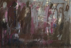
By the way, your mom’s drawing is amazing too!
Regards, Gabriela
Thanks Gabriela!!
I definitely do colour studies but more often when I’m working larger (this piece is really small!). That way I can try out possibilities before scaling up. And I DO make sure I repeat the layers from the chosen study into the larger piece. For that reason, I usually don’t do more than two layers in a colour study.
So interesting Gail, and of course these principles are translatable to other media, eg watercolour or acrylic paints, or a mixture!
So good to hear Jan and definitely YES re being applicable to other media. I’m happy that you’ve pointed that out 😁
VERY USEFUL ! ….. Blog Gail, thank you so much for sharing !
You are sooooooooo welcome Adrianne!! Happy to hear it’s useful 😀
Thanks for this! A great reminder to be bold rather than boring!
Hah! Yes Wendy – I think being bold and toning it down is easier than being timid and then trying to be bold later!
If you’re working from photographs I’m assuming you have them stored on your computer or laptop and have a program to view and adjust the photos, in which case you can simply turn up the saturation on the colour or use an overlay to change the scene. You should also be able to change the photo to black and white to show where the darks and lights are in the photo or try changing it to a sepia photo. All of these options are available on the standard Windows 10 program and help you to see your scene in a different light.
Thanks John! Yes, the photos are on my computer. And yes, I can turn up the saturation and do this on the odd occasion to see what will happen. But I don’t necessarily want to paint the saturated version. I prefer to make my own colour and saturation decisions.
I definitely use the de-saturation programme but usually to check my own work against my thumbnail (and for showing in a blog post). As you know, I’m a BIG believer in thumbnails. Doing these quick three value notations is such a great way to make value, format, and compositional decisions! Technology can help for sure but as an artist, I want to use my own choices, my own inclinations, to create my artistic vision. Hope that makes sense…
I really liked this post as I have many disappointing photos which you have encouraged me to use. I also think it’s rather magical that you got a deep violet for the base of the trees from the limited selection of pastels shown.
Thanks Eddie! Glad it’s inspired you to relook at some of your disappointing photos 😀
All the colours are relative to each other..so the deep violet is actually a pigment that isn’t at the dark end of the scale. Instead, it’s somewhere near the dark middle value…and then it appears darker compared to the other colours. Colour is magical isn’t it?!
Excellent blog. So good to have each step so clearly annotated. Thank you
So good to hear. Thanks Cherry!!
Your blog this month was so full of useful information for me Gail, thank you so much. I particularly like the suggestion to look for hints of colour and apply it as saturated, the tips on layering colour, but also how you illustrated composing your painting: it has a story to tell, but in a different way from a photograph. Being too precious about choosing a scene can be such a major stumbling block to actually painting!
Oh my gosh you’re so welcome Morag! I love hearing that it’s helpful. Love that you point out how we can get precious about choosing a scene, so much so that we don’t get to the painting. Thumbnails are such a great way to work through this obstacle!
This was something I found myself struggling with so I have employed Photoshop as a visual aid to keep me on the vibrant side. I’ll take disappointing photos and push the vibrancy and saturation in Photoshop to give me reminders as I’m laying on my colors. It’s like training wheels until I can do it on my own!
Tamara, it’s definitely useful to use Photoshop or Preview to up the saturation in a photo…to see what’s possible!
And I LOVE that you think of this tool as a version of training wheels. Sooooo….when will you take them off? 😬🙃
I’m new to pastel and this post is fantastic for me – not just because you’ve shown us how to brighten a scene with vibrant color, but also I found it very heartening to see what an amazing painting can be done with such a limited palette (since I only have a limited number of pastels!). Beautiful! Thank you
Awesome to hear Jean! The main thing is to have a range of values within your limited palette. Then you can be free with colour!!
Good lesson. One change you made at the end was to pull some foliage over the darker tree branches. I am always amazed at how much you can convey with so few pastels.
Yay Marsha!! And yes, well spotted!
And ahhhhh, I love to amaze 🙃😁
So timely, Gail. I’ve been painting a snow scene today and my reference photo was very monochromatic. The sky was white and any greenery was almost black. I took a look at Pissarro’s wintry skies and added purples and blues but I was a bit stuck on the trees as I wanted it to seem wintry. Your blog has given me the courage to go back in and liven it up!
Glad this post is timely Paula. And how brilliant of you to have a look at Camille Pissarro’s winter scenes and explore how he portrays winter. And how lovely that I’ve inspired you too!
Gail, thank you so much for this! Seems so easy yet not… I think I may just be so tied to the photo, that I get blocked!
You are welcome Angie! Thank you for the question 😀
And yes, easy to say, not so easy to do.
Maybe we will work on getting past the photo…?
Hi Gail I really enjoyed this blog it taught me a lot Many thanks S
Hi Sandy,
That’s sooooo good to hear 😁
Thank you!
Hello, fantastic and you make it look so simple!
A quick question, it looks like you did a bit of blending towards the end, did you use your pastel stick or was a finger involved?
Thank you and thanks for your awesome post!
Hey Cynthia, glad you like it!
To answer your question, no finger used just application of pastel which was sometimes more heavily applied near the end.
Oh thanks a lot for this subject. ..it’so so true…often when walking in nature a lot of fantastic colours keep my eyes. ..and then…when I try to paint them at home….pfffff. I admire how you change this landscape. Thanks again and I apologize please for my bad English which often doesn’t allow me to comment on your fantastic blog. Ghyl
Ghyl thank you so much for your comment which reads wonderfully. Mon français n’est pas si bon!
I’m glad you can relate to what I say in the post. It really is frustrating to miss all the wonder you experience in the photos you take. Happily, as artists, we have the power and imagination (sometimes at least!) to paint that feeling!
Sometimes you’re just like a Magician when you work your Pastels! 😁😁😁😁😁
Love your Mum’s sketch! 😁😁😁😁😁😁
Awww Ed, thanks so much!!
And yes, Mum is amazing sketcher (and artist too!!).
Just what I need! Thanks, Gail. So often I get into the ‘ultimate’ color/saturation too early. I find it very difficult to see where I intend to go with my painting without going there too early. Those lovely lights are so compelling.
Also, bought the Leach book.
Whoo hoo – clapping my hands Liz. That’s such a powerful realization! Because yes, those smashes of saturated colour can be applied near the end, when they will make the most impact.
And yay to Mark Leach’s book. It’s gorgeous!! Look forward to hearing and seeing how you are influenced by it. Hope you post your experiments in the IGNITE! Community 😀
As I seem to be seeing in this 2nd article I’ve read here, a very nice clarification of the creative muddle in my mind currently! Love it! Thanks so much, Gail 😊
Hah hah! I just replied to your comment on my recent article on Procrastination and love that you have found more clarification here Felipe! And oh my, you are so welcome!
This was such a great lesson. I’m always amazed at what you can create from a rather boring photo. It is so inspirational. I have such a problem with limiting color. I still struggle with wanting to pick up just one or two more pastels that would be just the perfect addition to the painting. Seeing what you can accomplish with so few pastels is really eye-opening.
Thanks Mary! There’s no problem with picking up a few more colours. The thing is to ensure a) you really need them and b) that you can use them in more than one place!
Thanks for another great lesson.
I don’t really understand this section- why that is necessar and why one can’t layer with a lighter value.
“The trick to pushing colour and playing with colour is to use hues of a similar value when you layer – dark over dark, light over light, and middle over middle.”
Thanks Lynn!
Okay, to your question. The way to avoid “muddy” colour is pretty much to work similar values over similar values. Try it!
Great job on pushing color. I attended the Colorado Pastel Society meeting today and saw a demo by Susan Mayfield, along a similar line of pushing color. Also good job on sticking to your limited palette. Loved mom’s sketch too.
Thanks so much Fran!
And oh yes, Susan’s work is wonderfully colourful! And yup – the same applies: Underetsand your value pattern and anything is possible in colour!!
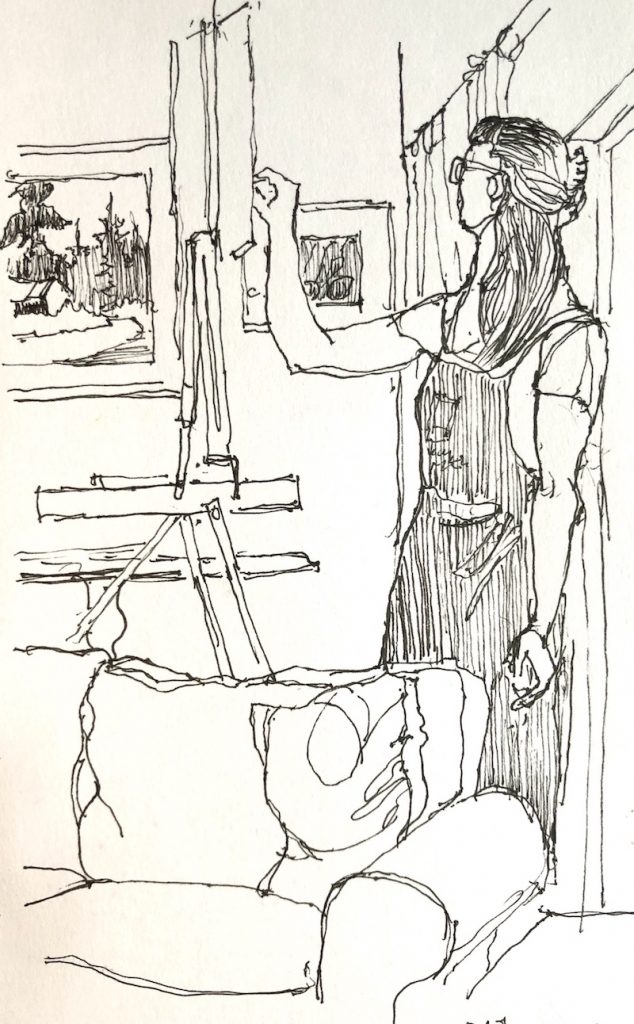
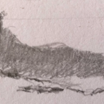
And thanks for the mention of my adorable mother’s sketch of me!
This was such a great lesson. I have such a problem with limiting color. I still struggle with wanting to pick up just one or two more pastels that would be just the perfect addition to the painting. Seeing what you can accomplish with so few pastels is really eye-opening.
Thanks Mary! I’m glad it was eye-opening!😁
Thank you for that information Gail. I am learning pastel, and have a hard time understanding how to use ‘all those colors’ and go beyond what the scene is showing to me, it was very helpful. You are a very talented artist!
Thanks so much Joanie!
And I’m glad to hear this post was helpful. Try taking one scene and repeating it in different variations staring with monochrome. Just play with it without expectation!